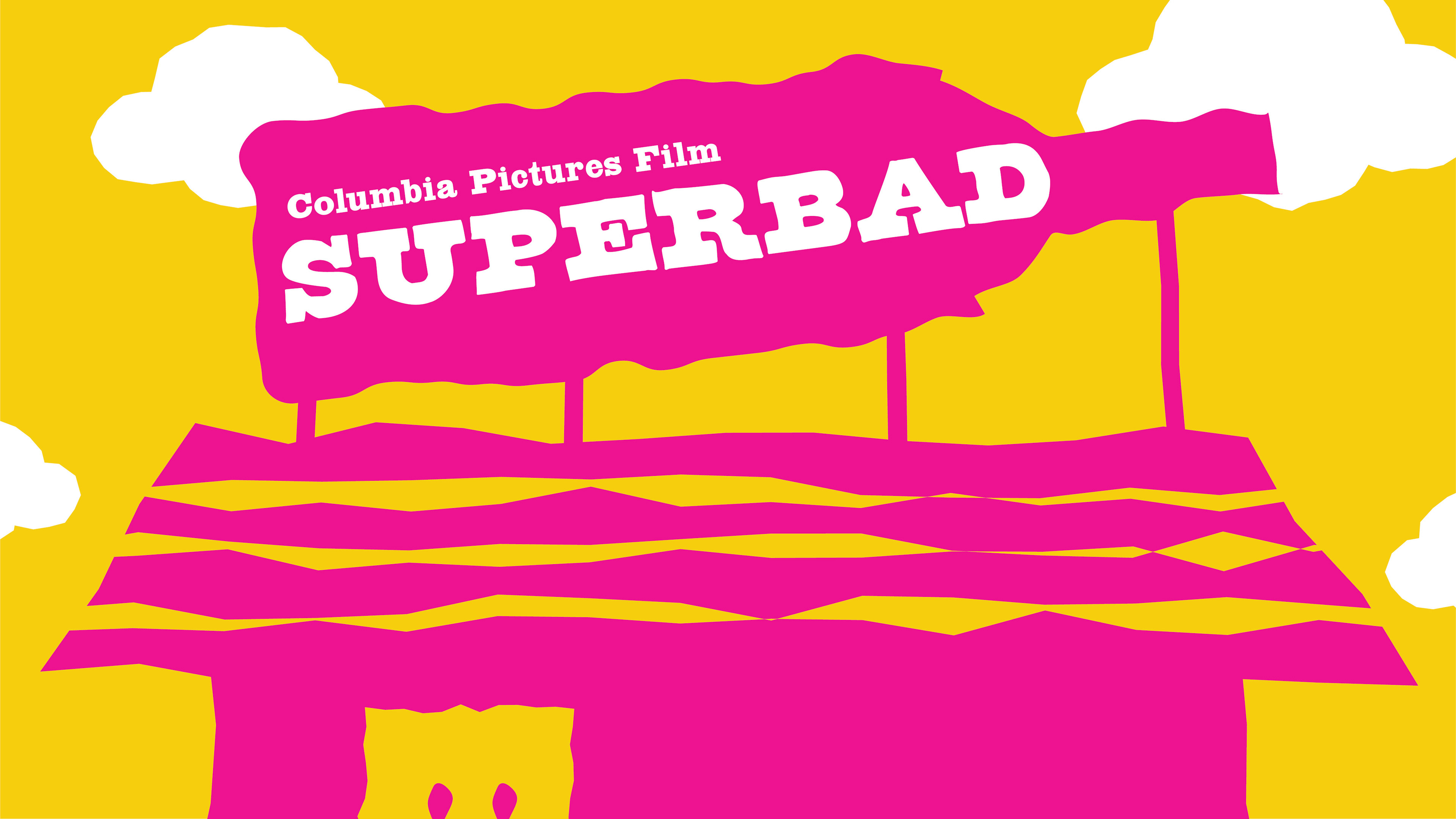
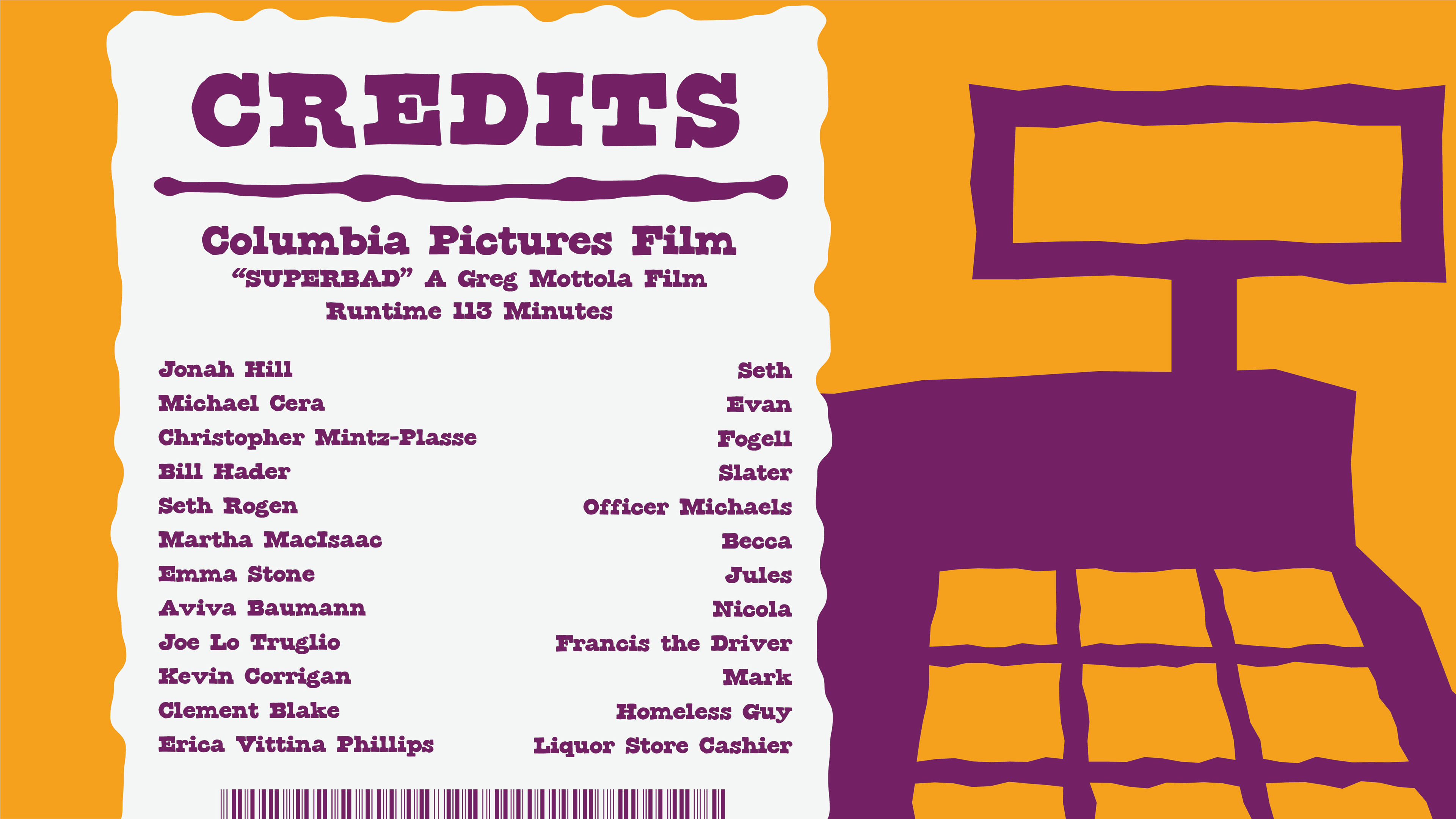
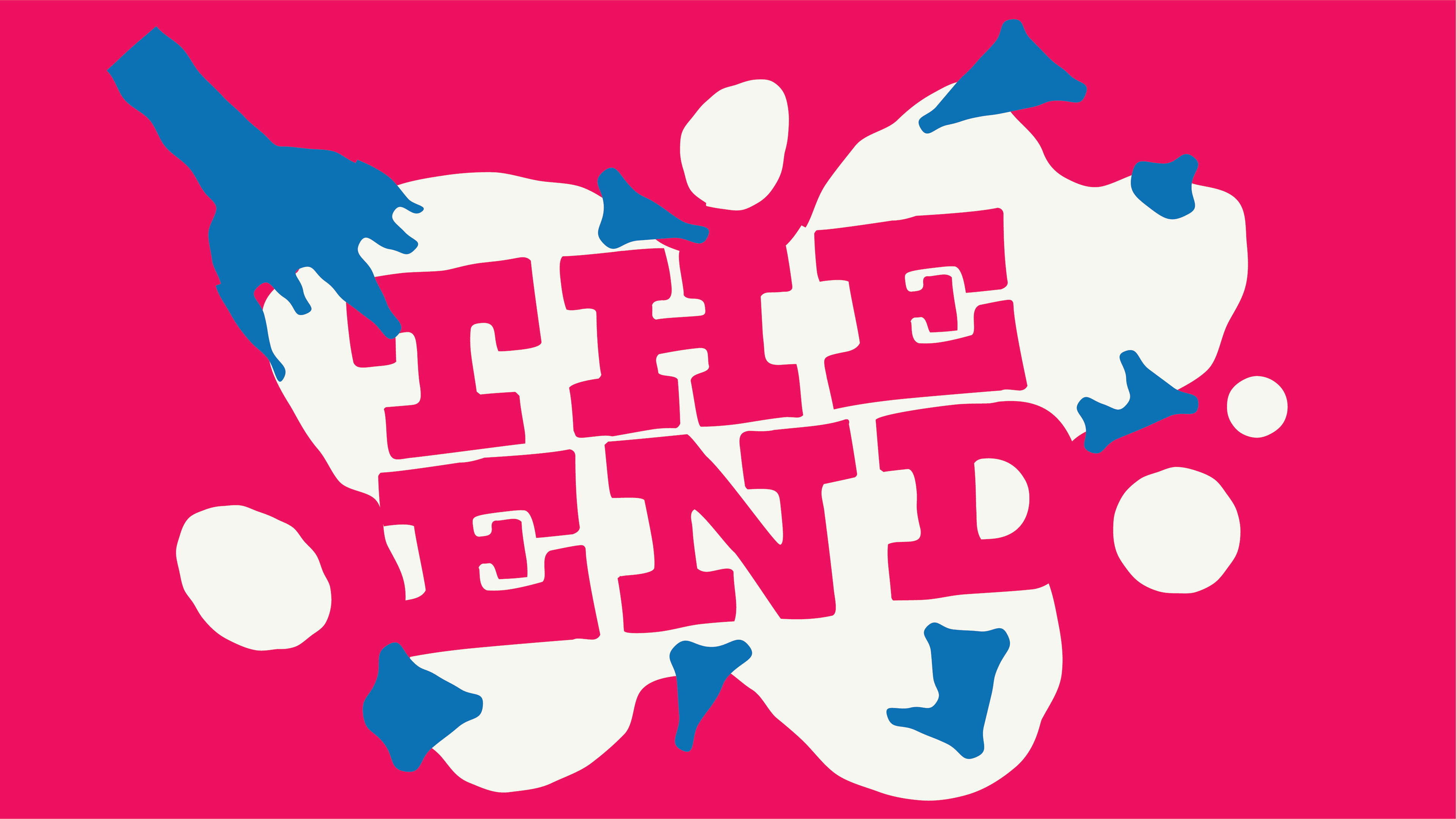
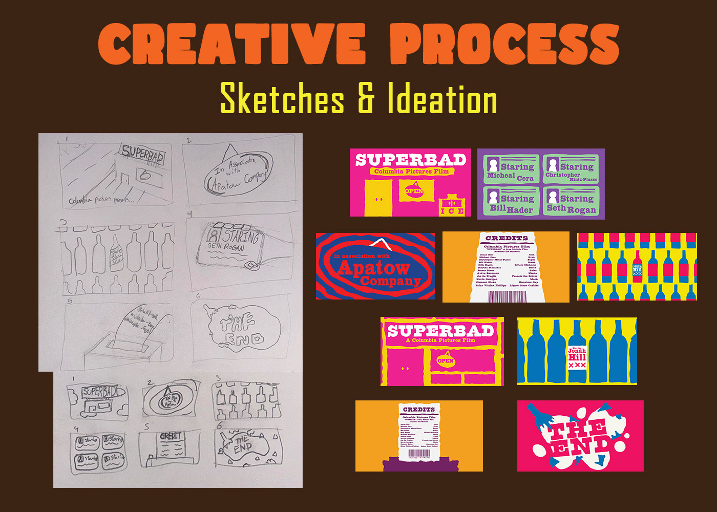
SUPERBAD
This project entailed me to recreate title cards for the movie "Superbad". Watching this movie was the start of my research in the project, writing down the themes and elements that came to mind when viewing. Next, I looked at other movie title cards to get a feel of how type is laid out and how information and story are conveyed. I started to sketch and based my idea on what I had written down from my viewing, research, and mood board. After I chose my 6 strongest ideas, I played with different patterns, colors, and typography to get the strongest composition out of them. This is how I ended up with my final six cards. In the design, I used the use of color, shape, type, and pattern to reflect the comedically inappropriate nature and tell the story of the movie “Superbad.” The high vibrance colors used represent the immature and young spirit of the movie. While the shapes are imperfect and create patterns to mimic the feeling of being drunk and intoxicated, which are the goals of the main characters. The typography chosen has a goofy and comedic feel to it from the presence of a slab serif. From frame to frame, you get brought through the process of how to purchase alcohol, starting with outside of the store, to selecting your bottle, showing your ID, and getting your receipt. This gives the viewer a snapshot of what they can expect from the movie through storytelling. This project was a challenge since I was restrained from how many cards I could make and how much information I had to convey through these title cards.