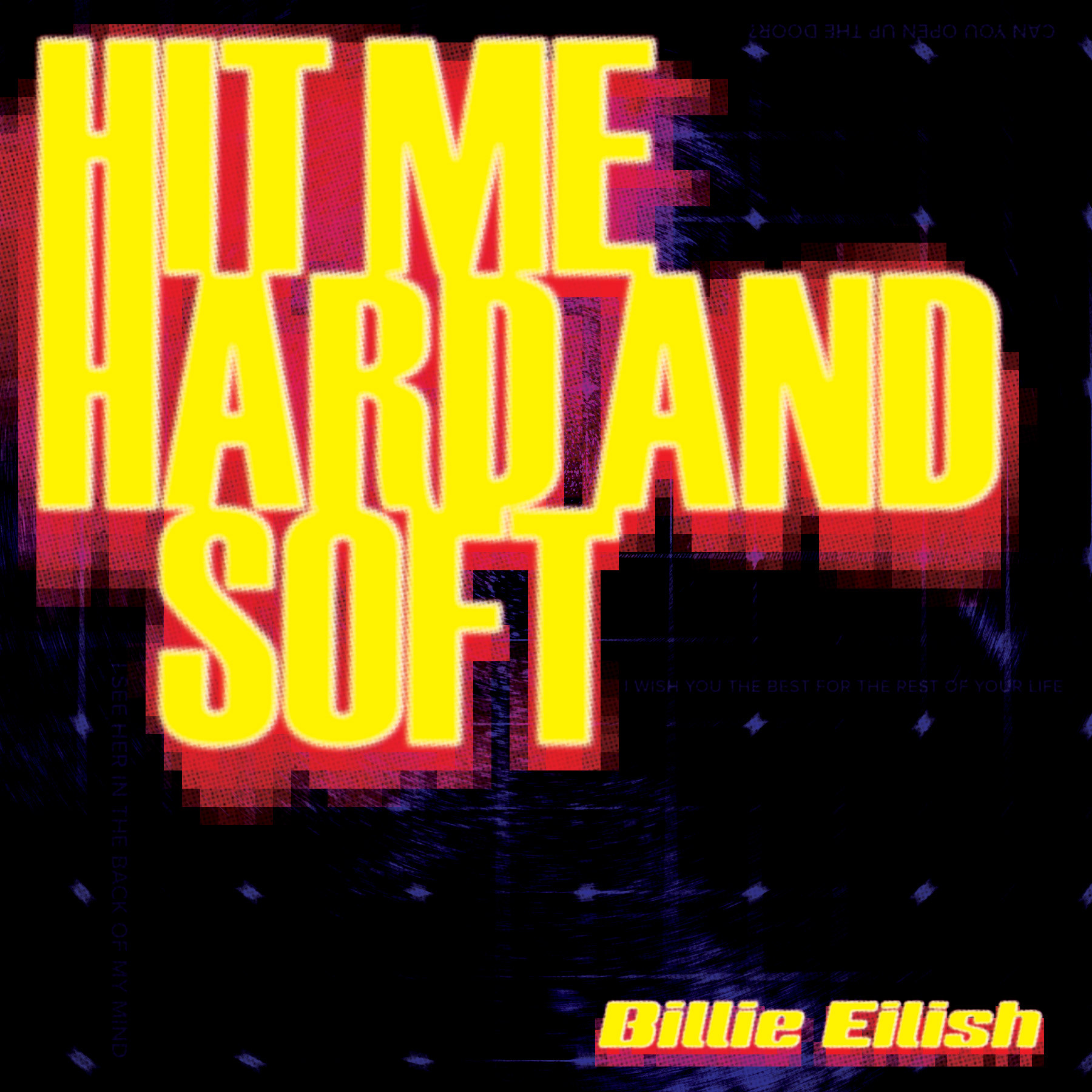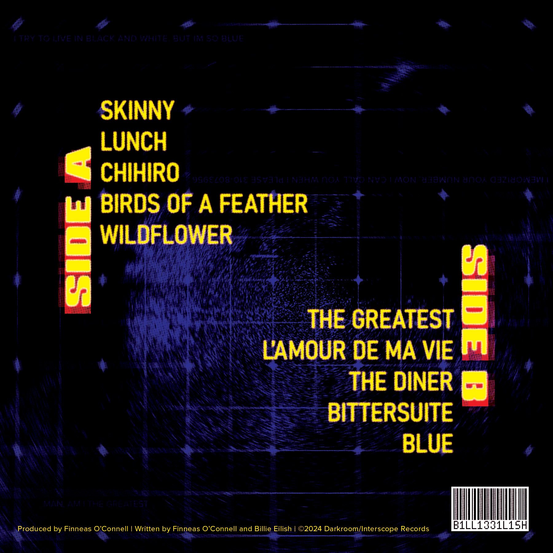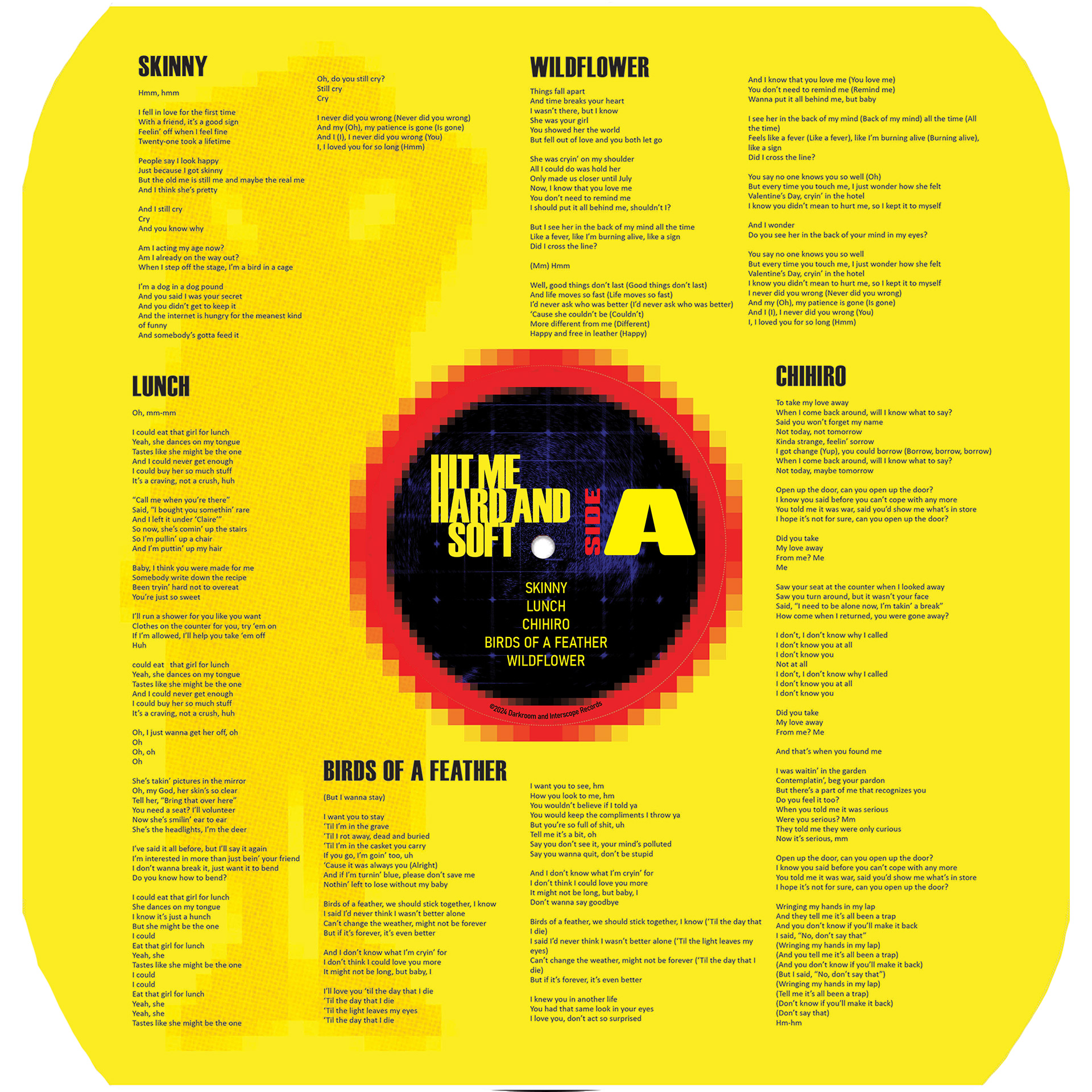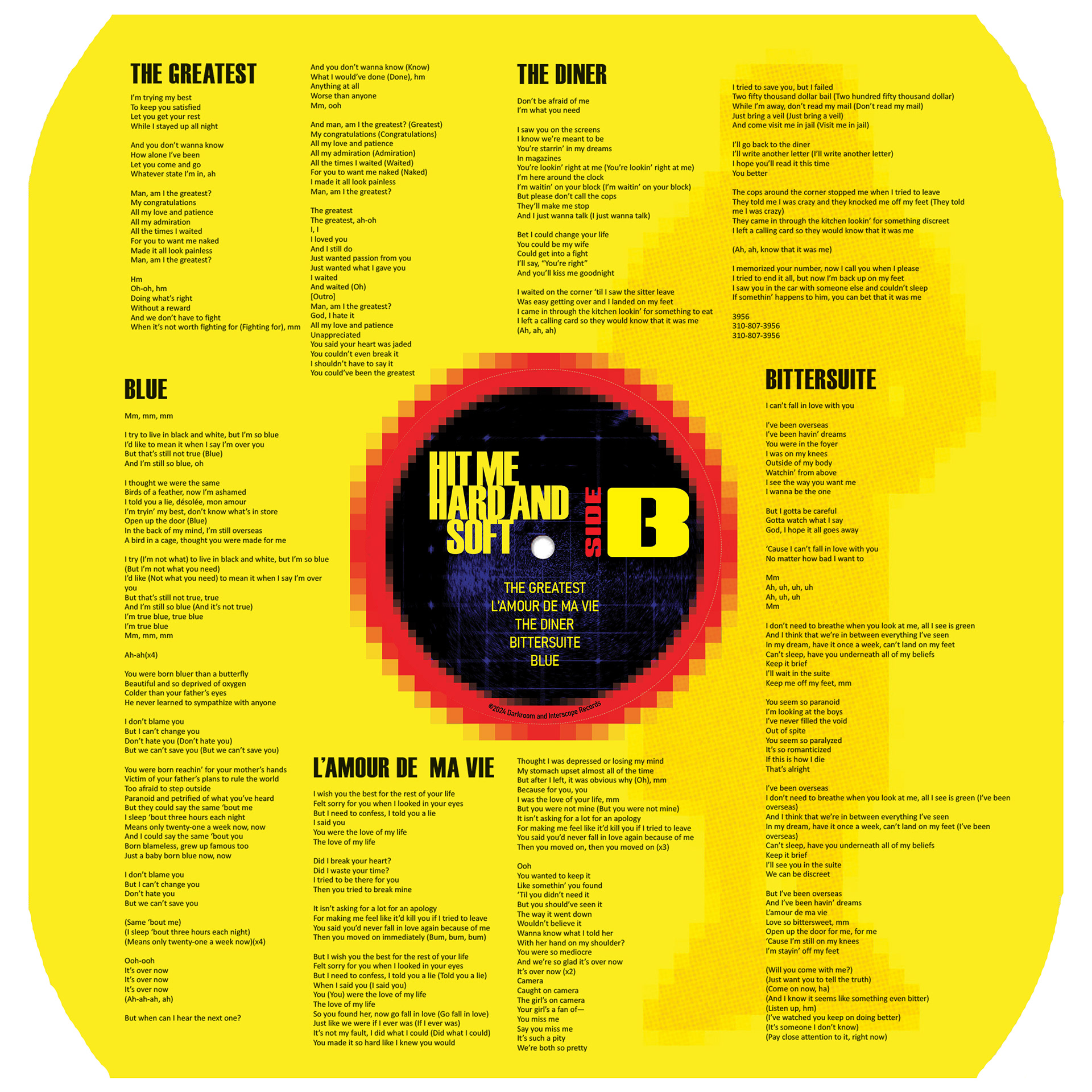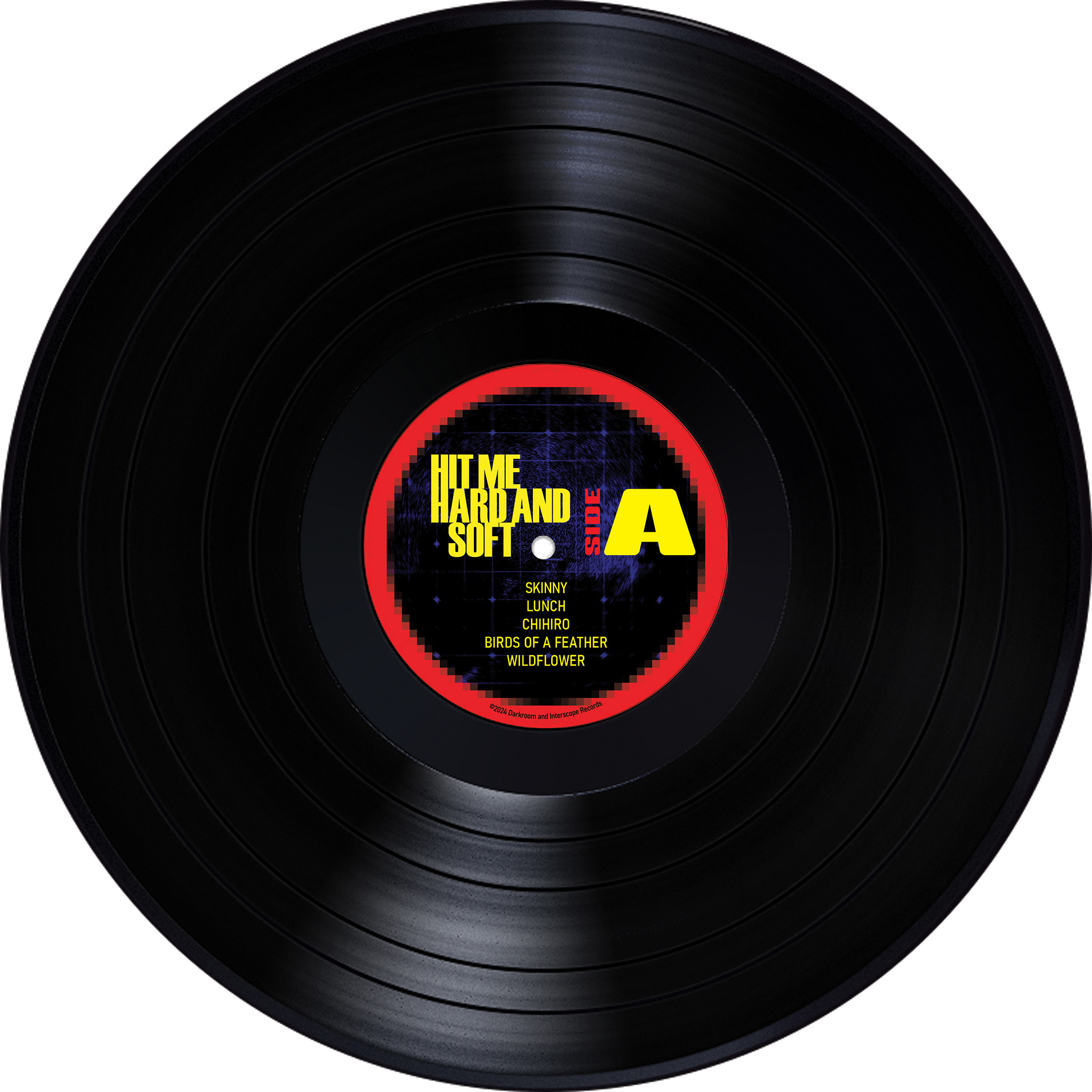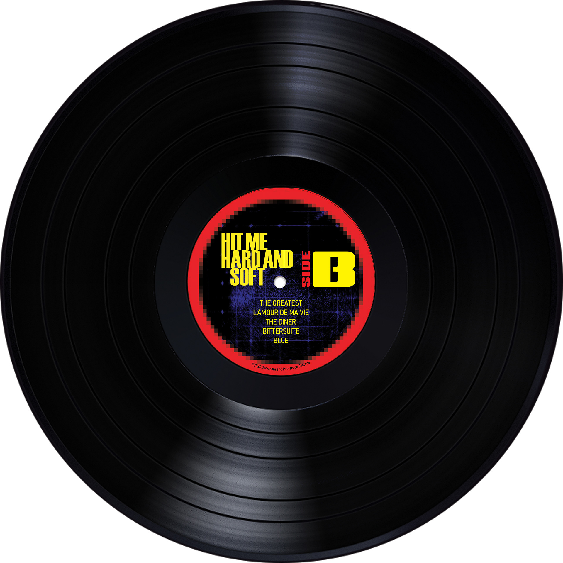
"HIT ME HARD AND SOFT" REDESIGN
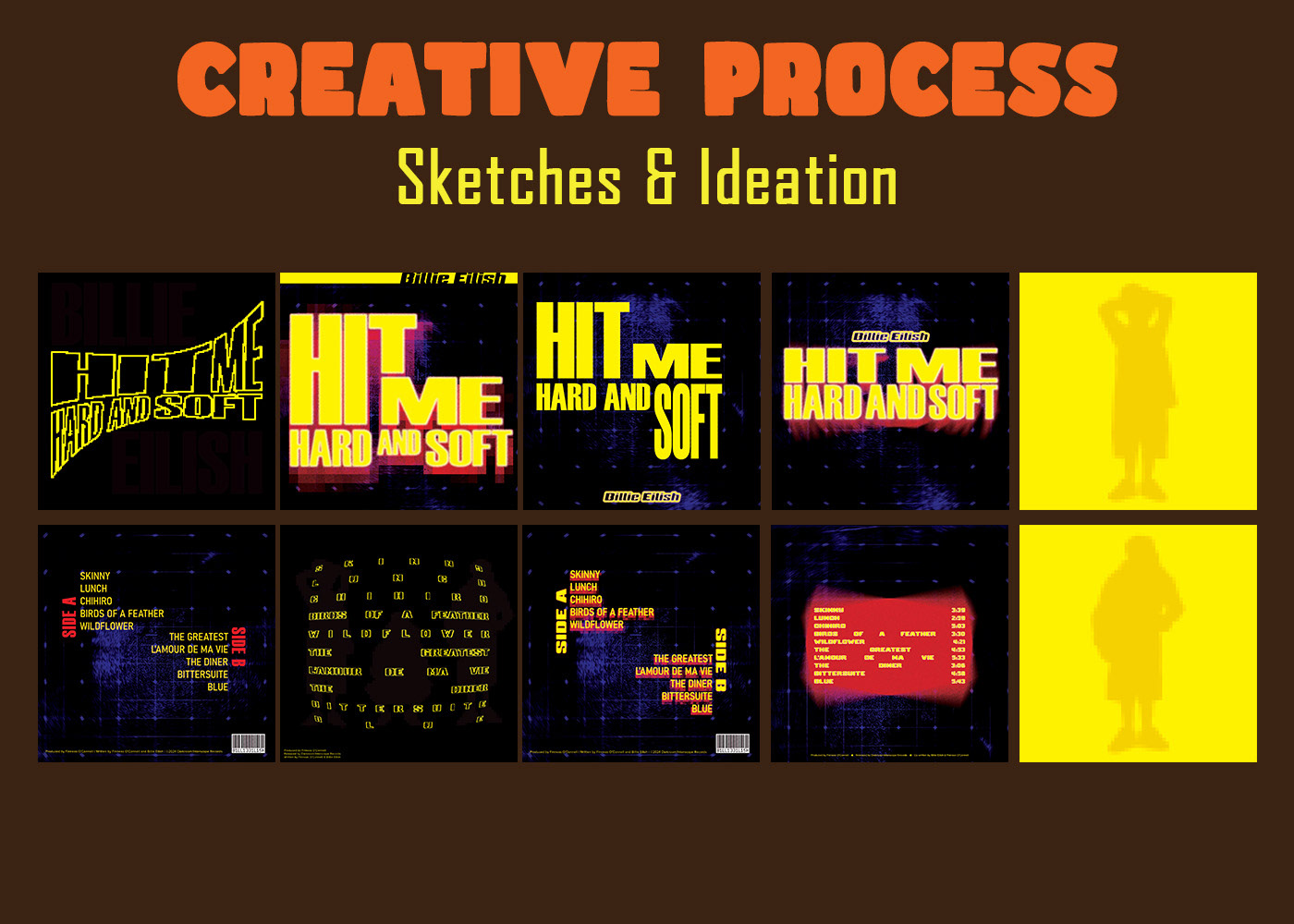
CHALLENGE
Redesign an album packaging without using any images, only typography
SOLUTION
An album packaging that represents the sound of the music through bold sans-serif typography that is blurred to represent the hard and soft sound of the music. Color choice, type hierarchy, and small details all nod back to the sound encapsulated in the album
RESULT
An album packaging that reflects the sound of the music visually through typography and style.
FINAL PRODUCT